If you’re managing a website you’ve likely heard of Google Analytics 4 (GA4) or Microsoft Clarity, or perhaps you’re already using one of them. Maybe you’ve wondered: Are these tools competitors? Do I need both? What’s the actual difference?
The short answer: they’re not rivals; they’re partners. GA4 and Clarity serve fundamentally different purposes, and understanding their distinct roles is the key to making smarter decisions about your website.
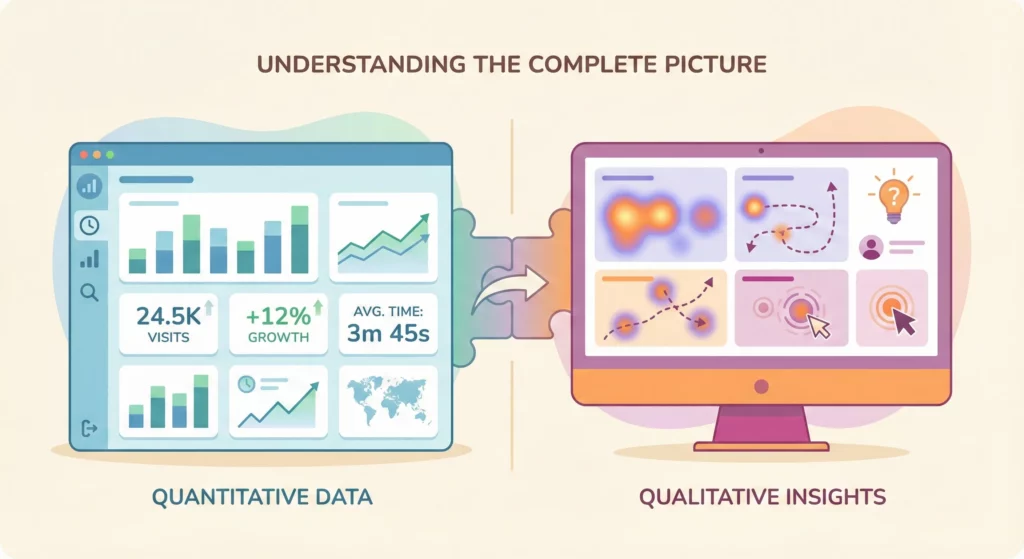
Here’s the core distinction: GA4 answers the “what” questions about your site, while Clarity answers the “why” questions. One gives you the numbers and trends; the other shows you the human behaviour behind those numbers. Used together, they create a complete picture that neither can provide alone.
This guide breaks down what each tool does best, when to use which one, and how they work together as a powerful system for continuous improvement. Whether you’re new to both tools or already using one, you’ll discover how to turn their combined insights into real business results.
Table of Contents
From Drowning in Data to Asking the Right Questions
For many small business owners, logging into a website analytics platform feels like opening the cockpit door of a jumbo jet. You are immediately confronted with a dizzying wall of charts, graphs, percentages, and acronyms.
It is an overwhelming experience, often described as “drowning in data.” The numbers are all there, but what do they mean? Which ones matter? And most importantly, what are you supposed to do with them?
The secret to making sense of it all is to change your approach. To turn this flood of information into actionable business decisions, you must stop looking at the numbers and start asking the right questions. This shift in mindset transforms data from a source of confusion into a source of clarity.
For any business with a website, there are two fundamental questions that need answers:
- “What is happening on my website?” This is the big-picture view: the facts, figures, and trends. It is the quantitative report card of your online presence.
- “Why is it happening?” This is the human story behind the numbers: the user behaviour, the context, and the experience. It is the qualitative explanation for your report card’s grades.
Two powerful and completely free tools have emerged as the definitive answers to these two questions. Google Analytics 4 (GA4) is the undisputed champion of answering the “What.” It provides the comprehensive, data-rich overview of your website’s performance. Microsoft Clarity is the master of answering the “Why.” It offers a visual, intuitive window into the actual experiences of your visitors, showing you precisely how they interact with your site.
They are not competitors. They are partners. One tells you there is a problem; the other shows you exactly what it is. To help you understand their distinct and complementary roles, here is a quick overview.
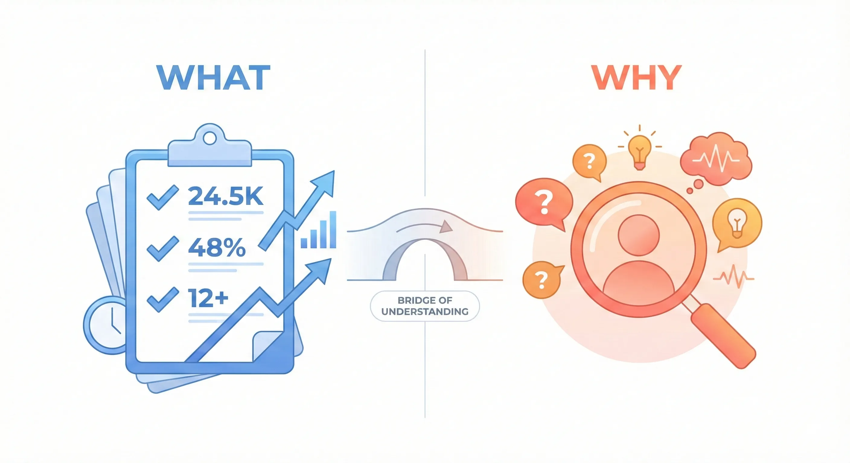
Table: GA4 vs. Clarity at a Glance
| Feature | Google Analytics 4 (GA4) | Microsoft Clarity |
| Primary Question | What is happening on my site? | Why is it happening? |
| Data Type | Quantitative (Numbers, charts, trends) | Qualitative (Visuals, recordings, user behaviour) |
| Key Features | Traffic Reports, Engagement Metrics, Conversion Tracking | Session Recordings, Heatmaps, Rage & Dead Clicks |
| Best For | Measuring marketing ROI, tracking goals, understanding traffic sources. | Improving user experience (UX), finding bugs, understanding user frustration. |
| AI Assistant (2025) | “Generated Insights” to explain data changes. | “AI Summaries” to analyse session recordings. |
A significant development for 2025 is how both platforms have integrated artificial intelligence to make their insights more accessible. In the past, interpreting GA4’s data or watching hours of Clarity’s recordings required a level of expertise or time that most small business owners simply do not have.
Now, both tools come with a built-in AI analyst. GA4’s “Generated Insights” feature automatically flags important changes in your data and explains them in plain English. Similarly, Clarity’s AI can now watch hundreds of session recordings for you and deliver a concise summary of common user behaviours and frustrations. This evolution marks a major shift; powerful analytics are no longer reserved for data scientists. These tools are now designed to provide direct, understandable business intelligence to everyone, making 2025 the perfect year to harness their combined power.
Section 1: The “What” Questions: What Google Analytics Tells You
Think of Google Analytics 4 as your business’s main dashboard or its official report card. It is the source of truth for the essential, high-level facts about your website’s performance. It does not guess or show you individual stories; it deals in concrete numbers and statistical trends. When you need to know the score, you turn to GA4. It is designed to answer the critical “what” questions that determine the health and success of your online strategy.
How are people finding my website?
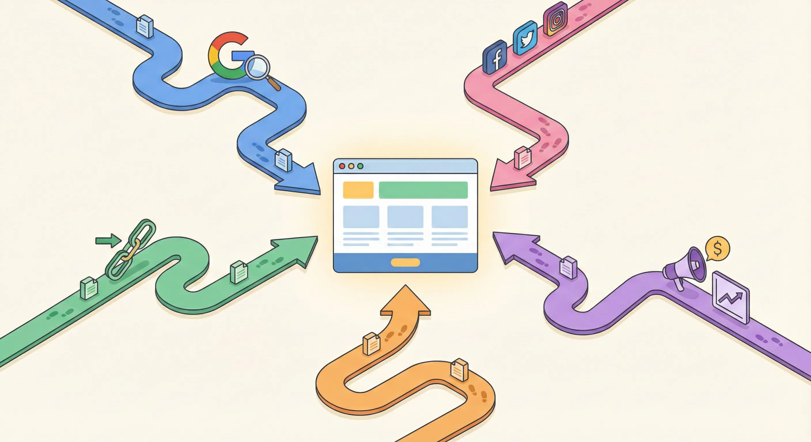
A website without visitors is like a beautiful storefront on a deserted street. The first and most fundamental question any business owner must answer is, “Where is my traffic coming from?” This is not just a matter of curiosity; it is the key to understanding which of your marketing efforts are paying off and which are falling flat.
The primary feature in GA4 for this is the Traffic Acquisition Report. In simple terms, this report is a detailed breakdown of how visitors arrived at your digital doorstep. It answers whether they took the “Google Search” highway (Organic Search), followed a “Facebook” side street (Social), were sent by a friend (Referral), clicked on an ad (Paid Search), or walked straight in the front door by typing your address (Direct).
By looking at this report, you can see exactly which channels are driving the most visitors, which ones lead to the most engaged users, and, most importantly, which ones result in conversions.
For example, you might discover that your blog posts are bringing in a steady stream of visitors from Google, but your social media efforts are generating more sales leads. This information is pure gold. It allows you to stop wasting time and money on channels that do not work and double down on the ones that do. In 2025, GA4 has continued to expand its integrations, now allowing you to import cost data from platforms like Pinterest, giving you an even more complete picture of your advertising return on investment.
Which pages are most important to my visitors?
Not all pages on your website are created equal. Some are workhorses that attract the majority of your traffic, while others may be rarely seen. To make smart decisions about your website’s content and design, you need to know which pages are resonating most with your audience.
GA4 answers this with the Engagement Report, specifically the “Pages and screens” section. This report provides a straightforward list of all your web pages, typically sorted by the number of views. It immediately reveals your website’s “greatest hits.” You can quickly identify your most popular blog posts, your most viewed product pages, or the service pages that capture the most attention.
This knowledge is incredibly powerful. Once you know your top five or ten pages, you can treat them like prime real estate. For instance, if a particular blog post receives 50% of your total traffic, it is the perfect place to put your most important call to action, such as a newsletter signup form or a link to a new product.
Conversely, the report also shows you which pages are performing poorly. Pages with very few views might need to be updated with better content, promoted more heavily, or removed altogether. This report turns your website from a simple collection of pages into a strategic asset where every piece of content has a purpose.
Are my marketing efforts working?
Ultimately, a business website exists to drive action. Whether that action is a completed sale, a new lead from a contact form, or a subscriber to your email list, these are the outcomes that grow your business. The most critical “what” question is whether your website is successfully encouraging visitors to take these important steps.
GA4 measures this through Conversions, which are built on its flexible, event-based data model. Do not let the technical terms intimidate you. An “event” is simply any interaction you want to track, and a “conversion” is an event that you have marked as being particularly important to your business. This could be anything from a user clicking the “Submit” button on a form to watching more than 75% of a promotional video.
You get to define what success looks like for your website, and GA4 will meticulously count every time it happens.
This allows you to connect your marketing activities directly to business outcomes. You can see not just which ad campaign brought in the most clicks, but which one brought in the most actual customers.
For 2025, the most significant advancement in this area is a feature called Generated Insights. This feature acts like a personal data analyst built directly into your reports. Instead of requiring you to manually sift through data to spot trends or anomalies, GA4’s AI does it for you. For example, you might log in and see a note directly on your dashboard that says, “You received 50% more users from your newsletter campaign this week compared to last week, leading to a 20% increase in contact form submissions.”
This transforms raw data into a clear, actionable story, making it easier than ever for a beginner to understand what is working. This evolution from passive data presentation to active analysis is profound. GA4 is shifting from being a simple reporting tool that looks backwards to becoming a strategic guidance system that helps you look forward. With predictive features that can identify users who are likely to purchase or churn, the platform is no longer just telling you what happened; it is starting to advise you on what you should do next. It is this forward-looking capability that makes GA4 an indispensable tool for any business aiming to grow in 2025. It provides the essential facts and figures you need to know if your website is healthy and your marketing is effective.
Section 2: The “Why” Questions: What Microsoft Clarity Shows You
Once Google Analytics has told you what is happening, the next logical question is always why. If GA4 is the report card that gives you the final grade, Microsoft Clarity is the video recording of the exam, showing you exactly where the student struggled. It closes the gap between the cold, hard numbers and the real, often messy, human experience behind them. Clarity is designed to build empathy, allowing you to see your website through your customers’ eyes and understand the “why” behind their actions.
Why are people leaving that important page?
GA4 might flag a critical page: like your pricing or checkout page: as having a high “exit rate,” meaning a large percentage of visitors leave your site from that page. This tells you there is a problem, but it offers no clues as to the cause. Is the page confusing? Is a button broken? Is the price too high? Guessing is inefficient and often wrong.
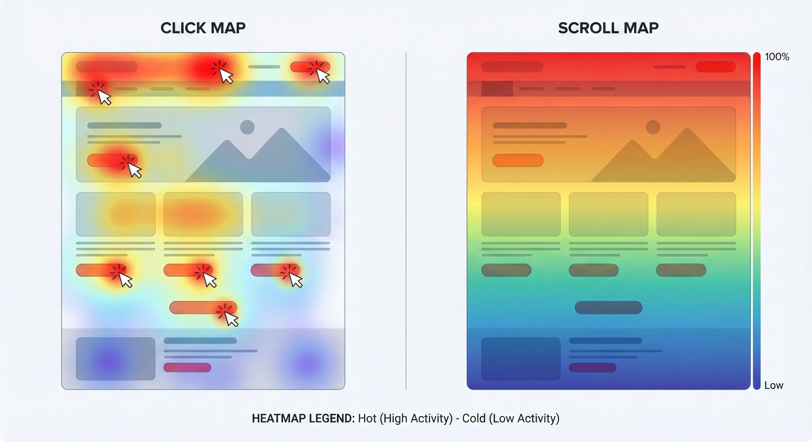
This is where Clarity’s Heatmaps provide immediate visual answers. A heatmap is a simple, colour-coded overlay on your webpage that visualises aggregated user behaviour. Think of it like a thermal image that reveals where the “heat” of user attention is concentrated.
There are two primary types that are invaluable for beginners:
- Click Maps: These maps show you exactly where people are clicking (or tapping on mobile devices). Areas with many clicks appear in “hot” colours like red and yellow, while areas with few clicks are “cold” blue and green. This can instantly reveal major issues. For example, you might see a bright red spot over an image that you intended to be purely decorative. This tells you that users think it is a button and are repeatedly clicking it, expecting something to happen. This is a clear sign of a design that is creating confusion and frustration.
- Scroll Maps: A scroll map shows you how far down a page the average visitor scrolls. The top of the page will be bright red, and it will gradually fade to blue as fewer and fewer people scroll down. This is crucial for understanding if your visitors are ever seeing your most important content. If your “Buy Now” button or contact form is located in a “cold” blue area at the bottom of the page, it means most of your visitors are leaving before they even have a chance to see it. This insight immediately tells you that you need to move your key call to action higher up the page.
Where are my users getting stuck or confused?
Sometimes, the problem is not a single element on a page but a whole process or user flow. A multi-step checkout process, a complex signup form, or even just navigating your main menu can be a point of friction where users get stuck, confused, and ultimately give up. Numbers in GA4 might show a drop-off in a funnel, but they cannot show you the moment of hesitation or the confusing step that caused it.
Clarity’s most powerful feature for this is Session Recordings. These are exactly what they sound like: anonymous video replays of a visitor’s entire journey on your site. You can watch their mouse movements, see where they scroll, observe where they pause or hesitate, and witness their experience firsthand as if you were looking over their shoulder.
For a small business owner, the immediate fear is, “Who has the time to watch hundreds of these videos?”
This is where Clarity’s 2025 updates have become a game-changer. The platform now includes AI-Generated Summaries, a feature that allows its AI to analyse up to 250 recordings at once and provide a concise, bullet-pointed summary of common behaviours, pain points, and trends. Instead of hours of manual review, you can get an actionable summary in seconds.
For instance, the AI might report, “25% of users on mobile devices struggled to find the ‘Next’ button in the checkout, often scrolling up and down multiple times before abandoning the page.” Furthermore, the new Notes feature allows you to collaborate directly within a recording. If you spot a specific moment of user confusion, you can pause the video, add a comment at that exact timestamp, and share it with your web developer or a team member. This eliminates the need for confusing emails and screenshots, allowing you to pinpoint problems with perfect accuracy and get them fixed faster.
What on my page is frustrating people?
One of Clarity’s most unique strengths is that it does not just wait for you to find problems; it actively surfaces moments of user frustration for you. It automatically tracks specific behavioural patterns that are clear indicators of a poor user experience and presents them on your main dashboard. These are known as Frustration Signals, and two of the most important ones for beginners to understand are:
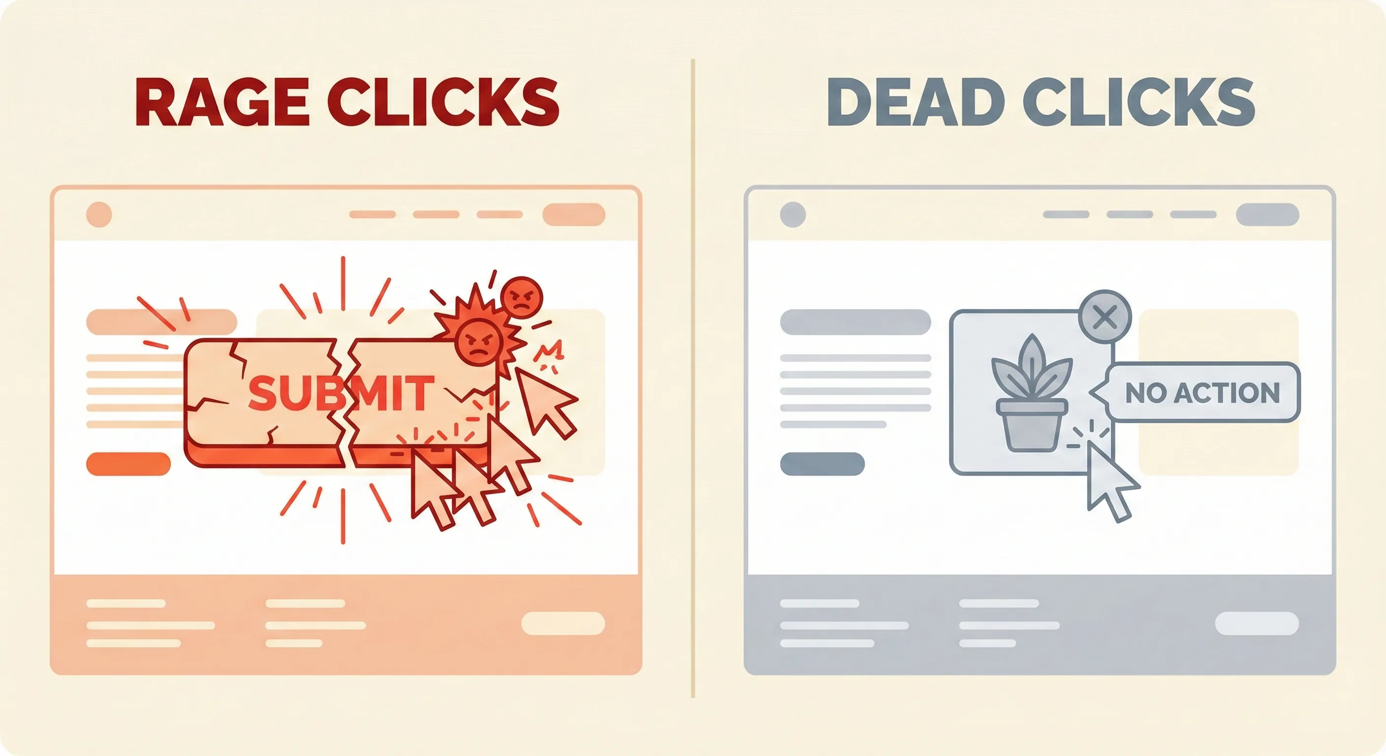
- Rage Clicks: This occurs when a user clicks the same spot on the page over and over again in rapid succession. This is the digital equivalent of someone repeatedly pushing an elevator button that is not working. It is an unambiguous signal of frustration and almost always indicates that a button, link, or other interactive element is broken or unresponsive.
- Dead Clicks: This happens when a user clicks on something they expect to be interactive, but nothing happens. We saw this in the heatmap example: a user clicking on a non-clickable image. A dead click is a clear sign that your website’s design is not meeting user expectations, leading to confusion.
These signals are automatically collected and highlighted on the Clarity dashboard, effectively creating an instant to-do list of the most urgent issues to fix on your website. By addressing these specific points of friction, you can make immediate and impactful improvements to your user experience.
Clarity’s true power lies in its ability to transform abstract data into tangible human experience. Watching a real person struggle with your website fosters a sense of empathy that numbers alone cannot provide. This changes the entire problem-solving mindset. The goal is no longer to “lower the bounce rate by 10%”; it becomes “we need to help this person who is trying to find our phone number but cannot because the ‘Contact Us’ link is broken.” This user-centric perspective, driven by the visual evidence Clarity provides, leads to more meaningful and effective website improvements.
Next Steps: Building Your Integrated Analysis Workflow
Set Up the GA4-Clarity Integration
The one-click integration between GA4 and Clarity creates a seamless workflow for moving from problem identification to diagnosis.
In Clarity, navigate to Settings > Integrations and connect your GA4 property. This automatically adds a “Clarity Playback URL” custom dimension to your GA4 reports, allowing you to click directly from GA4 metrics to corresponding Clarity session recordings.
This integration transforms your analysis from “checkout abandonment increased 40%” to watching exactly why users abandoned.
Start with High-Impact Problems
Focus on pages where GA4 shows concerning metrics:
- High exit rates on conversion pages
- Significant drop-offs in multi-step funnels
- Low engagement on important content pages
For each problem page identified in GA4, use Clarity’s session recordings filtered to that specific page URL to understand the user experience issues causing the metrics.
Create Your Investigation Protocol
Establish a repeatable process for turning data into action:
- GA4 identifies the “what”: Generated Insights flags unusual metric changes
- Clarity diagnoses the “why”: Session recordings and heatmaps show user behavior causing the issue
- Implement specific fixes: Address the actual problem revealed in recordings
- GA4 measures impact: Verify the fix improved your metrics
This closed-loop system removes guesswork and creates continuous improvement based on evidence.
Understanding the Complete System
GA4 and Clarity answer “what” and “why,” but they’re components of a complete measurement infrastructure. Understanding how they integrate with GTM for deployment, the Data Layer for reliable data capture, conversion tracking for optimization, and attribution for channel performance creates a system where you can measure performance, diagnose issues, and optimize systematically.
How to Build Your Marketing Measurement Foundation shows you how GA4 and Clarity fit within your complete measurement infrastructure, how to combine quantitative and qualitative data for investigation, and how these tools work together to transform observations into optimizations.
If You Need Help
Setting up GA4 and Clarity individually is straightforward, but building an integrated analysis workflow—proper event architecture in GA4, custom filtering in Clarity, cross-platform investigation protocols—requires understanding how the tools complement each other.
Our Marketing Measurement Foundation service provides complete implementation with proper integration setup if you prefer expert configuration.
Conclusion: The Full Story Requires Both Tools
Google Analytics 4 tells you what is happening, and Microsoft Clarity shows you why. One provides the diagnosis, the other reveals the cause. To make truly informed decisions about your website, you need both sides of the story.
The real power emerges when you use them together. Imagine this scenario: GA4’s Generated Insights flags that your checkout page exit rate increased 40% this week. The alarm is sounding, but you don’t know the cause. You click through to Clarity’s session recordings and immediately see the problem – a new promotional pop-up is covering the “Pay Now” button on mobile devices, causing frustrated users to abandon their purchase.
Without GA4, you might never realise the problem exists. Without Clarity, you’d waste weeks testing pricing and copy while the real issue, a simple design flaw, continues costing you sales.
This integrated approach creates a continuous improvement system: GA4 identifies problems, Clarity diagnoses causes, you implement targeted fixes, and GA4 measures the impact. No guesswork, just evidence-based optimization that makes your website better every day.
Together, these free tools give you the complete picture you need to fix real problems, enhance customer experience, and grow your business with confidence.